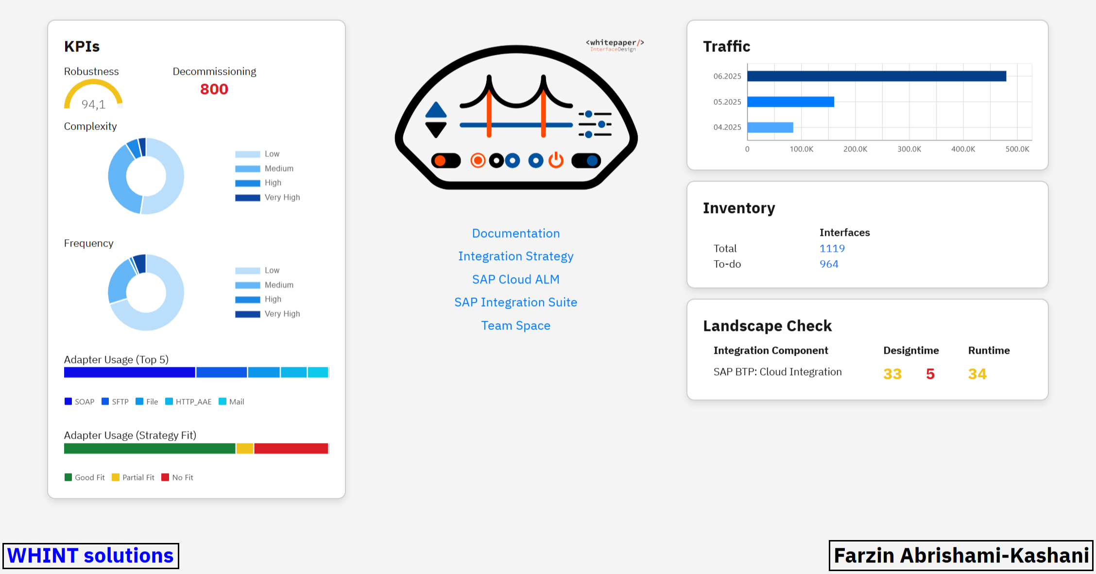
The Integration Cockpit Dashboard provides a centralized, real-time snapshot of key components and metrics across your entire integration landscape.
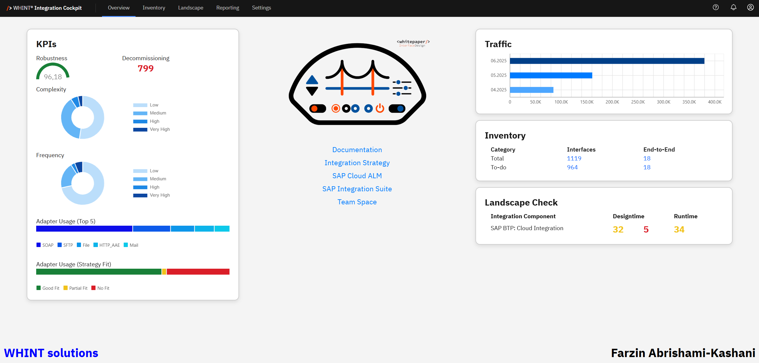
Designed with Integration Experts in mind, it delivers instant visibility into the purpose and usage of each component.
By monitoring your most critical KPIs, the Dashboard empowers you to:
-
Quickly identify bottlenecks, outliers or deviations
-
Proactively address areas that may require attention, optimization or cleanup
Customizing Overview Start Page
The appearance of your cockpit may differ. To tailor your view, customize the Start Page under
Settings → Configuration → Start Page
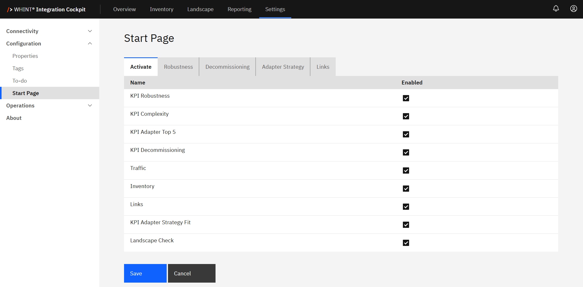
Recommendation
Enable all checkboxes in the Start Page Settings (see screenshot above) to ensure that all key KPIs and metrics are fully displayed on your Dashboard.
KPIs
A KPI (Key Performance Indicator) is a measurable value used in the Integration Cockpit to assess the performance, reliability and efficiency of your integration landscape.
This section provides a summary of your most important KPIs.
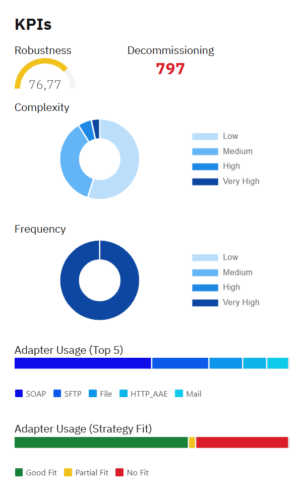
Note: Click on the KPI names in the "KPI Quick Links" to jump to the detailed explanation for each metric. The right sidebar can also be used for navigation.
Robustness
Robustness is a KPI that indicates how stable and reliable an interface has been over the past 30 days. It helps identify unstable interfaces that may require attention.
The calculated Robustness value on the overview page is an aggregated value across all productive interfaces. It is showing the relation between successfully processed messages and their errors, helping you identify unstable or potentially flawed integrations.
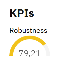
Robustness KPI Example
In the shown example, a score of 79.21 and a Yellow bar indicates that most messages were processed successfully, but some errors occurred. This places the robustness in the 71–90% range, which aligns with "Acceptable: Minor issues" according to the table below in Static Ranges.
Quick Tip
Higher scores indicate better interface performance and stability.
The calculation window always includes the most recent 30 days, up to today.
(e.g. for a calculation on Jan 10, 2025, the period is Dec 12, 2024 – Jan 10, 2025)
Static Ranges
Robustness scores fall into one of the following four predefined categories, referred to as Static Ranges. These show the robustness as a percentage of success vs. failure in percent:
|
Range |
Meaning |
Interpretation |
|---|---|---|
|
0–50 |
≤50% of the messages in the last 30 days were successful |
Poor: Frequent failures |
|
51–70 |
51–70% of the messages in the last 30 days were successful |
Below average: Unstable performance |
|
71–90 |
71–90% of the messages in the last 30 days were successful |
Acceptable: Minor issues |
|
90+ |
90% of the messages in the last 30 days were successful |
Good: High reliability |
The four ranges and the period are currently static and not configurable.
Robustness Bar Color Ranges
You can define your own Robustness bar colors with specific thresholds under
Settings → Configuration → Start Page → Robustness
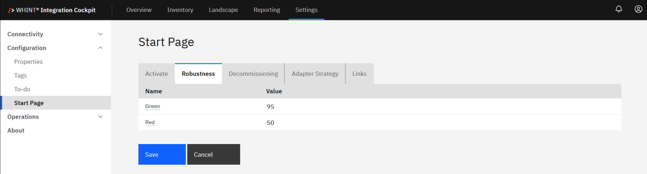
With the configuration shown above:
-
Green is applied to values 95 and above
-
Red applies to values 0 to 50
-
The Yellow range (51–94) is assigned automatically as the span between the red and green thresholds.
Where else you see Robustness
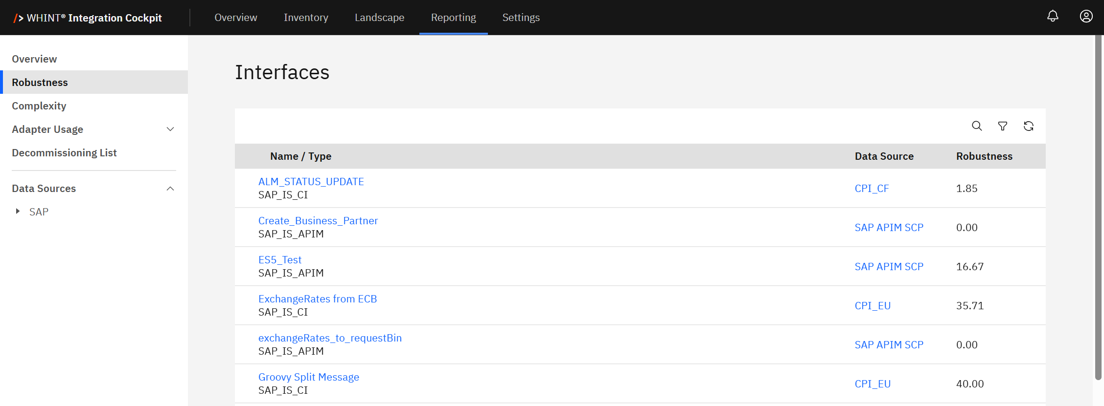
On Interface level
You can view the robustness of individual interfaces within the Reporting & Metadata section:
Inventory → Interfaces → Catalog → <Select Interface> → Reporting & Metadata
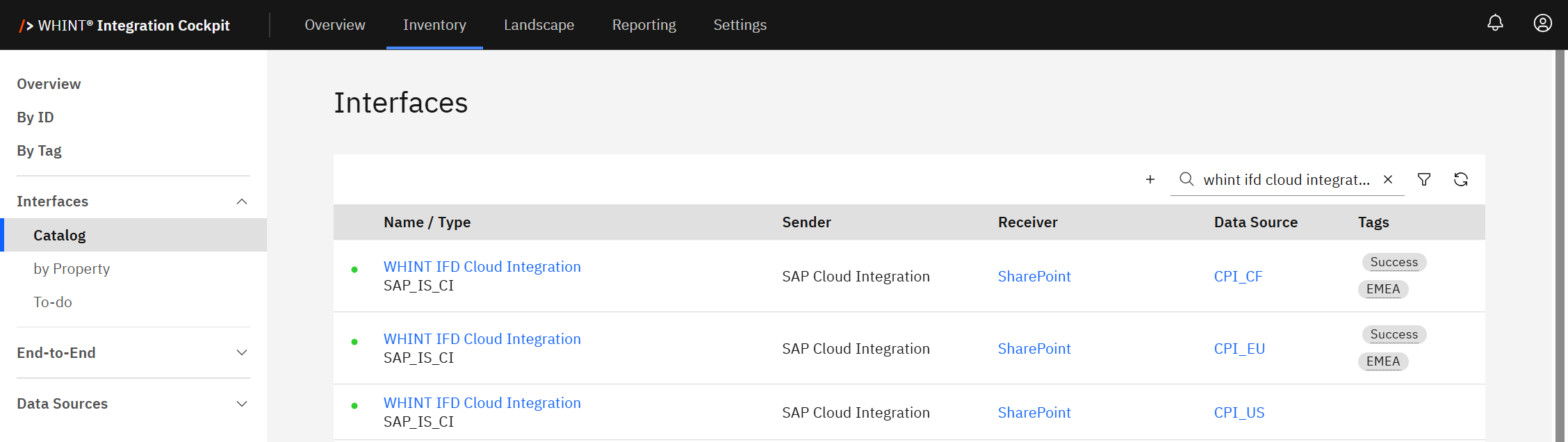
This screen displays a list of interfaces available in your environment.
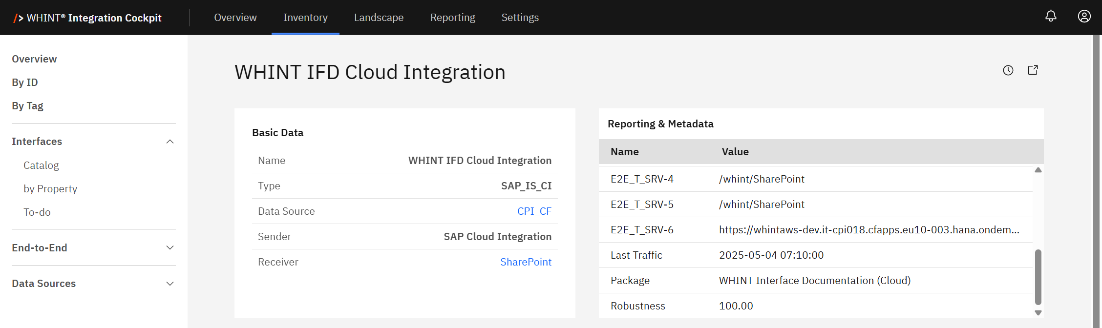
The Robustness score reflects the stability of the selected interface based on recent message processing performance.
On End-to-End level
A total robustness score is calculated across all interfaces within an End-to-End process.
This is displayed in the following section:
Inventory → End-to-End → <Select E2E> → Reporting
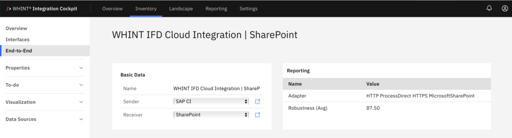
In the Reporting Section – Robustness Overview
In the Reporting Overview, only robustness scores from interfaces in the PRODUCTION category are displayed. This is displayed in the following section:
Reporting → Overview
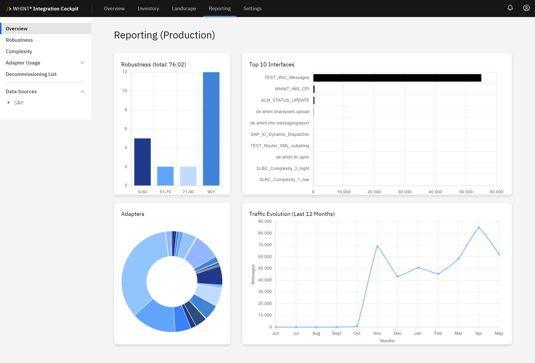
This dashboard displays the following:
-
Robustness distribution across four Predefined Score Ranges
-
Top 10 interfaces by volume or relevance
-
Insights such as Adapters and Traffic Evolution over the last 12 months (based on message count)
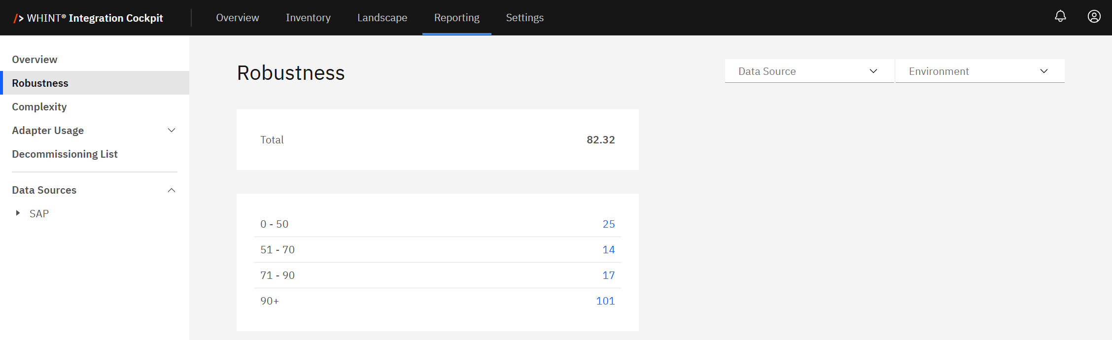
In the Reporting Section - Robustness
The Reporting – Robustness dashboard provides a centralized view of robustness scores across all interfaces, regardless of environment.
Quick Tip
Use this section to monitor the overall health and performance of your interfaces by environment and data source.
This dashboard provides:
-
An aggregated robustness score across all interfaces
-
A calculated total robustness value for each selected environment category (e.g. Production)
Robustness score classification
-
0–50 → Low
-
51–70 → Medium
-
71–90 → High
-
90+ → Very High
You can filter this view by:
-
Data Source
-
Environment Category:
-
DEVELOPMENT
-
PRODUCTION
-
QUALITY
-
Additionally, you can select your own custom environment if configured.
For setup and customization, see 2.5 Environments in the Onboarding guide.
Supported Data Sources for Robustness
-
SAP_IS_CI: SAP Integration Suite (Cloud Integration)
Robustness Formula:
Robustness = COMPLETED / TOTAL-
Note: RETRY and ENDED statuses are ignored.
-
-
SAP_IDOC: SAP ABAP Backend IDocs
Robustness Formula:
Robustness = (Success + Warning * 0,5) / TOTAL-
Note: Ignores IDocs with 'Ready' status.
-
Decommissioning
Decommissioning is a KPI that tracks the number of interfaces in the Production environment that have not processed any messages (no traffic) over the past 30 days.
It helps identify inactive, outdated or unused interfaces that may be candidates for cleanup or retirement.
The KPI supports cost optimization, reduces system complexity and helps improve overall integration quality.
A high number of inactive interfaces may indicate technical debt - components that are no longer in use but still exist in the current landscape. These can include temporary workarounds (such as the use of “No Fit” adapters) that were never properly replaced.
The more unused or outdated interfaces remain, the harder and riskier it becomes to maintain, scale or even troubleshoot your integration landscape.
By removing what is no longer needed, you keep your integration environment clean and stable.
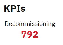
Decommissioning KPI Example
In the shown example, a value of 792 and a red color indicates a high number of inactive interfaces.
This places the decommissioning value in a review-worthy range, according to the set thresholds in Decommissioning Threshold Configuration.
Recommendation
Higher values suggest cleanup is needed.
Review the decommissioning KPI at least quarterly to avoid build-up of outdated interfaces.
The calculation window always includes the most recent 30 days, up to today.
(e.g. for a calculation on Jan 10, 2025, the period is Dec 12, 2024 – Jan 10, 2025)
Decommissioning Threshold Configuration
You can define the threshold ranges and bar colors for the Decommissioning KPI under
Settings → Configuration → Start Page → Decommissioning
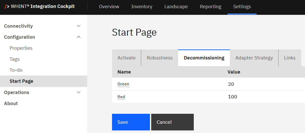
With the configuration shown above:
-
🟩 Green: Fewer than 20 inactive interfaces (no traffic in Production in the last 30 days)
-
🟥 Red: More than 100 inactive interfaces
-
🟨 Yellow: Automatically spans between Green and Red thresholds
Note: The “value” refers to the number of inactive interfaces.
Complexity
Complexity is a KPI that shows how technically complicated an interface is within your integration landscape. It is based on various factors, such as the number of connected systems, types of adapters used and whether mapping logic or transformations are involved. This metric aids in assessing the development and maintenance effort required for each interface.
Each interface is automatically classified into one of four categories:
-
Low
-
Medium
-
High
-
Very High
This classification gives you a quick overview of how simple or complex your interfaces are to manage, monitor and maintain.
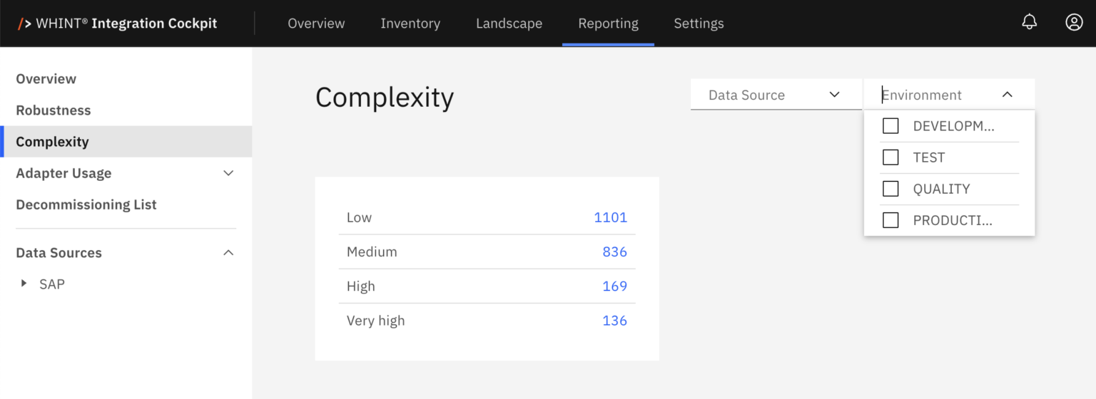
The Complexity KPI helps to:
-
Spot technically complex interfaces that may become bottlenecks
-
Support simplification efforts by identifying where redesign might reduce effort or risk
-
Improve stability and maintainability by reducing unnecessary complexity
Simpler interfaces are typically easier to support, faster to adapt and more reliable in production.
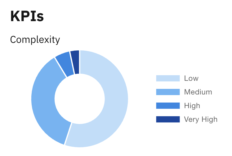
Complexity KPI Example
In the shown example, the pie chart visualizes the distribution of interfaces based on their design complexity. A large portion of interfaces falls into the Low and Medium categories, which suggests a manageable landscape.
Quick Tip
You can click any segment of the pie chart (e.g. Low, Medium, High, Very High) to view a list of the affected interfaces.
However, the presence of High and Very High complexity interfaces indicates potential candidates for review or optimization - especially if those interfaces also score high on other KPIs like Frequency or Error Rate. A noticeable concentration in the High or Very High range indicates the need for a targeted simplification or redesign efforts.
Recommendation
Use the Complexity KPI to continuously monitor integration design trends and proactively prioritize simplification - especially during platform migrations, lifecycle planning or large-scale optimization initiatives.
Complexity Classification by Interface Type
Depending on the Data Source, interfaces in the Inventory can be classified as more or less complex. The following table shows the criteria by interface type:
|
Interface Type |
Complexity:
|
Complexity:
|
Complexity:
|
Complexity:
|
|---|---|---|---|---|
|
SAP BTP Integration Suite (Cloud Integration) |
< 5 elements in Integration Flow BPMN and no XSLT or Message Mapping is used (basically pass-through) |
>= 5 & <= 14 elements in Integration Flow BPMN or XSLT or Message Mapping is used |
>= 15 & <= 30 elements in Integration Flow BPMN |
> 30 elements in Integration Flow BPMN |
|
SAP BTP Integration Suite (API Management) |
< 2 policies (basically pass-through) |
>= 2 & <= 5 policies |
>= 6 & <=10 policies |
> 10 policies |
|
SAP Process Orchestration |
no mapping, no routing (basically pass-through) |
only mapping (no routing) OR
|
mapping: yes
|
lookups in mapping or async-sync modules |
|
Microsoft Azure API Managment |
< 2 policies (basically pass-through) |
>= 2 & <= 5 policie |
>= 6 & <=10 policies |
> 10 policies |
|
Microsoft Azure Logic Apps |
tbd |
|
|
|
|
MuleSoft Anypoint App |
tbd |
|
|
|
|
MuleSoft Anypoint API |
tbd |
|
|
|
Frequency
Frequency is a KPI that measures how often each interface is executed within the monitored period (past 30 days). It provides a quick overview of runtime activity across the integration landscape and helps identify how actively interfaces are being used.
Interfaces are automatically classified into four static frequency categories based on message volume:
-
Low
-
Medium
-
High
-
Very High
This classification is calculated using live traffic data and is updated regularly to reflect current usage patterns.
The Frequency KPI helps to:
-
Identify high-traffic, business-critical interfaces that are executed frequently and may require extra monitoring or safeguards
-
Prioritizing monitoring and alerting coverage for high-frequency flows
-
Detect underused or inactive interfaces that may be outdated or no longer needed
-
Plan resources and capacity (e.g. scaling, performance tuning) based on how much traffic each interface handles
Interfaces in the Very High category typically handle significant volumes of traffic and may require additional safeguards, such as:
-
Custom alert thresholds tailored to high activity levels
-
Robust error-handling mechanisms to prevent cascading failures
-
Performance tuning or infrastructure scaling to maintain system stability
On the other hand, low-frequency interfaces may indicate limited business relevance or outdated use. These should be reviewed - especially when combined with other KPIs like Complexity or Decommissioning - to determine whether they are still needed or can be retired.
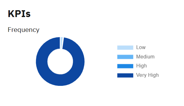
Frequency KPI Example
In the example shown, the pie chart visualizes the distribution of interfaces across frequency categories, providing an instant overview of interface activity across the landscape.
The majority of interfaces fall into the Very High category - suggesting a highly active environment with potential hotspots that should be monitored closely.
Recommendation
Use the Frequency KPI to align operational monitoring with business-critical traffic patterns. Prioritize resource allocation (e.g. support, alerting, scaling) based on interface load and regularly re-evaluate rarely used interfaces.
Adapter Usage (Top 5)
Adapter Usage is a KPI that displays the five most frequently used adapters in your integration environment - for example, SOAP, SFTP, File, HTTP_AAE or Mail.
It highlights the technology distribution and dependency concentration across your landscape.
Adapter Usage KPI helps to:
-
Identify dominant protocols and technologies
-
Detect potential single points of failure due to over-reliance on specific adapter types
-
Support standardization and modernization by reducing fragmented or legacy adapter usage
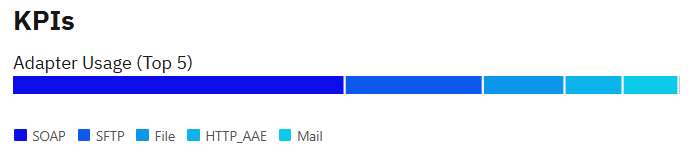
Adapter Usage Example
The bar chart shows adapter usage frequency based on runtime data across all active interfaces. A strong dominance of a single adapter (e.g. SOAP) may be a candidate for review in the context of strategy fit, scalability and platform best practices.
Recommendation
Use this KPI to support architectural decisions, simplify adapter usage and promote standardization.
Adapter Usage (Strategy Fit)
The Strategy Fit indicator displays how well the adapters used in your interfaces align with your enterprise’s integration strategy.
Defining clear fit categories supports future design decisions, identifies modernization needs and helps detect strategic misalignment early.
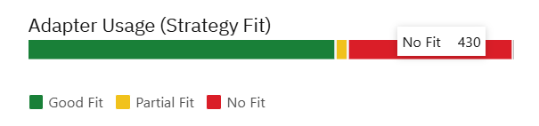
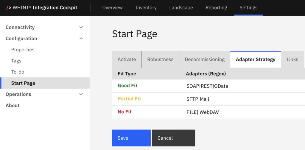
You can define which adapters meet your integration strategy. Choose from the following values:
-
🟩 Good Fit: Adapters which are meeting the requirements well, e.g. REST, OData, AS2
-
🟨 Partial Fit: Adapters which are not ideal, but can not be avoided, e.g. SFTP, Mail
-
🟥 No Fit: Adapters which are black-listed in the integration landscape, e.g. FTP
Recommendation
Use this feature to ensure consistent and fit adapter usage across your integration landscape. Regularly review and adjust fit levels to stay aligned with your evolving technology standards and strategic priorities.
To define or edit your strategy fit categories:
Settings → Configuration → Start Page → Adapter Strategy
Integration Cockpit Dashboard
The Dashboard Panel in the Integration Cockpit provides a centralized dashboard with customizable Quick Links for easy access to the external resources most relevant to your organization.
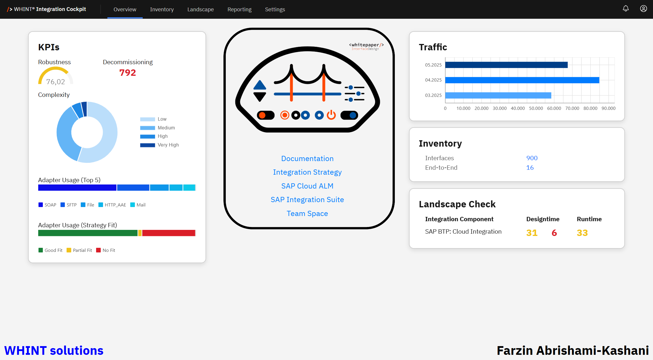
In the displayed example, the following resources are added as Quick Links:
-
SAP Integration Suite – Direct access to the SAP Integration Suite environment.
-
Documentation – Link to the Integration Cockpit user documentation.
-
Integration Strategy – Link to the organization’s documented integration approach.
-
SAP Cloud ALM – Link to SAP Cloud Application Lifecycle Management.
-
Team Space – Link to a collaborative workspace.
Recommendation
Make sure to add your own relevant Quick Links for the most frequently used resources in your organization.
Managing Quick Links
You can modify and customize Quick Links under
Settings → Configuration → Start Page → Links
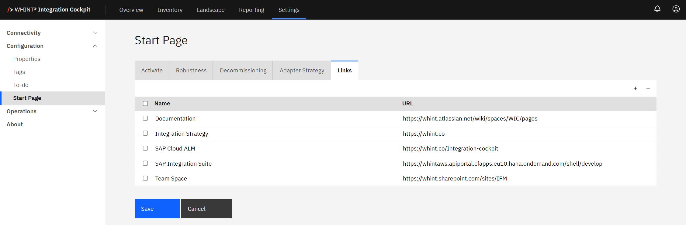
Add a Link:
Click the “+” icon, enter a Name and URL, then click Save.
Remove a Link:
Select the checkbox next to the link you want to remove and click the “−” icon.
Traffic
Traffic provides visibility into the number of messages processed across your productive interfaces over the past three months. It helps you identify usage patterns, monitor integration activity and support capacity planning across all your integration landscape.
The calculated Traffic value on the overview page is based on the Message Count from the Production environment and includes the current and previous two calendar months. It reflects the total number of messages processed, helping you monitor fluctuations in system load and usage.
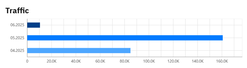
Traffic Example
In the shown example, the bar chart displays monthly message volumes for April to June 2025.
It visualizes the total number of messages processed each month across your integration landscape.
This allows you to:
-
Identify activity trends over time
-
Spot load peaks or unusual drops in traffic
-
Align volume trends with business or system events
Quick Tip
Consistently high message volumes may indicate healthy integration activity.
Sudden changes should be reviewed to ensure ongoing performance and scalability.
The calculation window always includes the most recent 30 days, up to today.
(e.g. for a calculation on Jan 10, 2025, the period is Dec 12, 2024 – Jan 10, 2025)
Inventory
The Inventory is the central repository of the Integration Cockpit. It collects and displays all discovered integration interfaces and related metadata from connected systems and landscapes - forming the foundation for visibility, enrichment and governance across your integration environment.
Explanation of Metrics
|
Metric |
Value |
Meaning |
|---|---|---|
|
Interfaces |
1119 |
Total interfaces discovered and cataloged in Production environment |
|
To-do |
964 |
Interfaces and E2E Interfaces requiring further enrichment (e.g. system/object mapping, tags, properties) and transformation |
|
End-to-End |
18 |
Fully harmonized integration flows with complete sender-receiver context |
These metrics represent:
-
Interfaces → Discovery coverage
-
To‑Do → Transform and Enrichment completeness
-
End-to-End → Business-level integration maturity
Inventory Example
The shown example illustrates a typical early-stage inventory profile: a broad set of discovered interfaces, but limited business-level readiness due to missing enrichment. The metrics below highlight current coverage and remaining gaps.
-
1119 Interfaces have been discovered and cataloged in the production environment
-
964 To‑do interfaces indicate a large portion of the inventory still requires enrichment (e.g. system/object mapping, tags, properties)
-
18 End‑to‑End integrations are fully defined, indicating low traceability across complete integration chains
-
18 End‑to‑End To-Do’s are fully defined, indicating low traceability across complete integration chains
A high To‑Do count signals incomplete Transformation Rule Mappings and a lower integration maturity. Reducing this count improves data quality, supports EAM exports and strengthens integration transparency.
Recommendation
Use the Inventory as a strategic entry point into your integration landscape.
Focus on:
-
Enriching interfaces with metadata and creating Transformation Rules
-
Defining complete End‑to‑End flows
-
Monitoring To‑Do volume as a maturity indicator
Landscape Check
The Landscape Check provides an overview of your integration environment across tenants. It helps you assess consistency and completeness of integration artifacts in both Design- and Runtime for each integration component.
Artifacts are evaluated in two scopes:
|
Scope |
Purpose |
|---|---|
|
Across tenants |
Checks version alignment between environments (e.g. DEV → PROD) |
|
Within a tenant |
Compares Designtime vs. Runtime versions |
These checks are grouped into the following categories:
|
Category |
Meaning |
|---|---|
|
Designtime |
Checks integration design versions across tenants |
|
Runtime |
Checks deployed integration artifacts across tenants |
|
Mismatch |
Highlights differences or missing artifacts |
The displayed values are based on the number of integration artifacts found in each environment and their version status.
The Landscape Check helps to:
-
Validate whether integration content is consistently deployed across tenants
-
Monitor Designtime and Runtime alignment within each tenant
-
Detect outdated, inconsistent or missing integration artifacts
Color indicators
These visual markers help you quickly interpret version status:
-
🟨 Yellow: Version mismatch
-
🟥 Red: artifact is missing or has been deleted
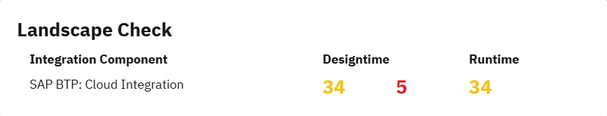
Landscape Check Example
In the shown example for SAP BTP: Cloud Integration, the numbers indicate:
Designtime
-
34 yellow entries: This represents the total number of integration flows and configurations that have a different Designtime version across the landscape.
-
5 red entries: These indicate missing artifact versions - meaning 5 artifacts are absent in at least one tenant despite being deployed.
Runtime
-
34 yellow entries: The number of artifacts that are currently deployed and have a runtime version mismatch.
Only deployed integration artifacts are considered during runtime checks.
Even if Runtime shows full deployment, red entries in Designtime reveal gaps in version alignment.
These are often caused by incomplete transports or manual changes, such as the deletion of integration packages.
Quick Tip
Each number in the Landscape Check panel is clickable and links to the detailed list of affected artifacts.
Note: For detailed analysis, see Landscape Check for SAP Cloud Integration in WHINTIC
Footer Information
The footer of the Integration Cockpit provides quick access to critical metadata and organizational context:
-
Bottom Left – Company Branding:
Displays the brand identity, such as WHINT Solutions, reinforcing platform origin and credibility. -
Bottom Right – Logged-in User Identification:
Shows the active user's full name (e.g. Farzin Abrishami-Kashani), ensuring session transparency and audit clarity.
This area serves as a persistent reference point, especially helpful in shared environments where user accountability and platform ownership are crucial.
Last Updated: Jun 25, 2026