
The Reporting section provides comprehensive analytics and insights into your integration landscape performance, traffic patterns, and architecture quality. Use interactive dashboards to monitor KPIs, identify optimization opportunities and support data-driven integration decisions.
Navigate to Reporting to access production analytics and environment-specific insights across all connected integration platforms.
Best Practices for Reporting Analysis
-
Daily monitoring: Check Overview dashboard for immediate landscape health insights
-
Weekly trends: Review Traffic Evolution for capacity planning and anomaly detection
-
Monthly assessment: Analyze Robustness and Complexity distributions for improvement opportunities
-
Quarterly reviews: Use Adapter Usage and Authentication reports for technology strategy decisions
-
Documentation: Export or screenshot key metrics for stakeholder reporting and compliance documentation
Reporting Dashboard Overview
The main Reporting view displays your current Production environment with four key visualization panels that provide immediate insights into integration landscape health and performance.
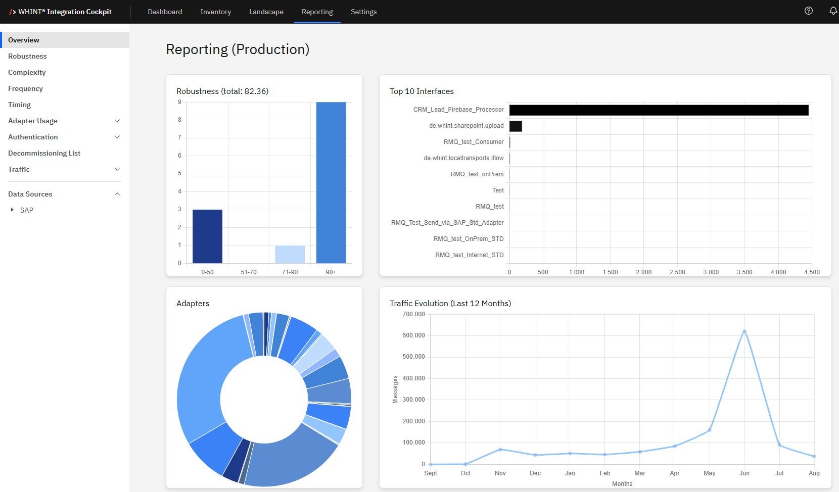
Robustness
What you see:
-
Bar chart showing interface distribution across robustness score ranges (0-50, 51-70, 71-90, 90+)
-
Total robustness score displayed (e.g. "total: 82.36")
-
Hover interaction reveals exact interface counts per robustness level
How to use:
-
Hover over bars to see exact interface counts in each robustness range
-
Identify problem areas: Low robustness scores (0-50) indicate interfaces requiring attention
-
Track improvements: Monitor shifts toward higher robustness categories over time
-
Click ranges to drill down into specific interface lists
Business value: Quickly assess integration stability and prioritize maintenance efforts on underperforming interfaces.
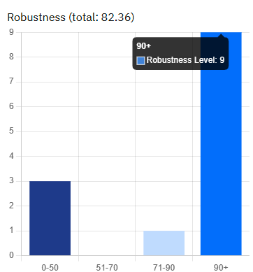
Top 10 Interfaces
What you see:
-
Horizontal bar chart displaying the 10 most active interfaces by message volume
-
Interface names with corresponding traffic volumes
-
Hover tooltips show exact message counts
How to use:
-
Hover over bars to see precise message volumes
-
Identify high-traffic interfaces that may need performance optimization
-
Click interface names to navigate to detailed interface analysis
-
Monitor changes in top interface rankings over time
Business value: Focus optimization efforts on highest-impact interfaces and understand traffic distribution patterns.
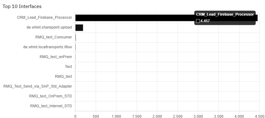
Adapter Technology Analysis
What you see:
-
Pie chart displaying adapter type distribution across your integration landscape
-
Proportional segments showing relative usage of each adapter technology
-
Hover interaction reveals exact adapter counts
How to use:
-
Hover over segments to see exact adapter counts and percentages
-
Assess technology distribution: Understand your integration architecture composition
-
Identify modernization opportunities: Spot legacy adapters that may need updating
-
Click segments to filter interfaces by specific adapter types
Business value: Support technology strategy decisions and modernization planning based on actual adapter usage patterns.
Traffic Evolution Monitoring
What you see:
-
Line chart showing message volume trends over the last 12 months
-
Monthly traffic patterns with clear peak and trough identification
-
Hover interaction displays exact message counts for specific months
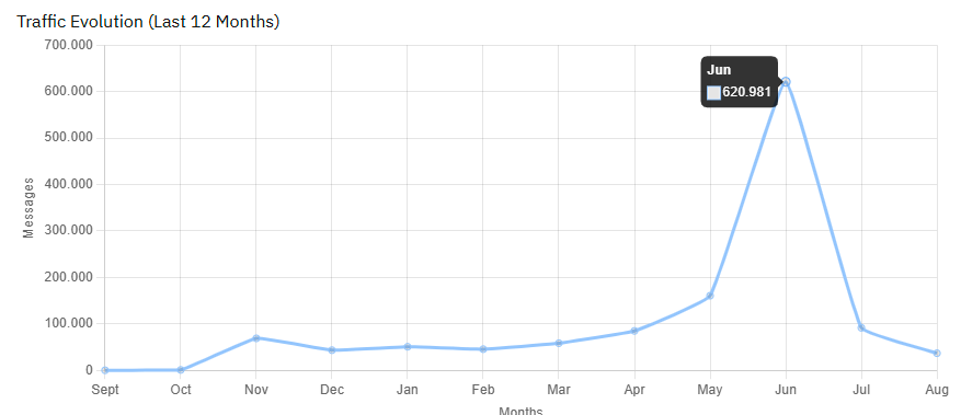
How to use:
-
Hover over data points to see exact monthly message volumes
-
Identify seasonal patterns: Understand business cycle impacts on integration traffic
-
Spot anomalies: Investigate unexpected spikes or drops in message volume
-
Capacity planning: Use trends to predict future infrastructure needs
Business value: Enable proactive capacity planning and identify business-driven traffic patterns for resource optimization.
Reporting Navigation
Left sidebar navigation provides access to specialized reporting views:
Core Analytics:
-
Overview - Main dashboard with key metrics summary
-
Robustness - Detailed interface stability analysis
-
Complexity - Interface complexity distribution and scoring
-
Frequency - Message frequency patterns and scheduling analysis
Technical Insights:
-
Timing - Performance timing analysis across interfaces
-
Adapter Usage - Comprehensive adapter technology breakdown
-
Authentication - Security method analysis and compliance tracking
-
Traffic - Detailed message volume analytics and trends
Operational Views:
-
Decommissioning List - Interfaces identified for retirement
-
Data Sources - Source system analytics (expandable by platform like SAP)
Navigation workflow:
-
Start with Overview for landscape health summary
-
Click specific metrics to drill down into specialized views
-
Use Data Sources to filter analysis by platform or environment
-
Return to Overview for cross-functional analysis
Last Updated: August 21, 2025