
The Monthly Traffic by Data Source view provides a comprehensive visualization of message traffic patterns across your integration landscape over time. This view helps you analyze traffic trends, identify peak usage periods, and understand the relative activity levels of different integration platforms.
Navigate to Reporting → Traffic → Month by Data Source to access the monthly traffic analysis by data source.
Purpose
Track message volume trends across different data sources over time to identify usage patterns, seasonal variations, and platform-specific traffic characteristics for capacity planning and performance optimization.
Monthly Traffic Overview
Monthly Traffic by Data Source displays message traffic data in both visual and tabular formats, allowing you to analyze traffic patterns across multiple integration platforms simultaneously.
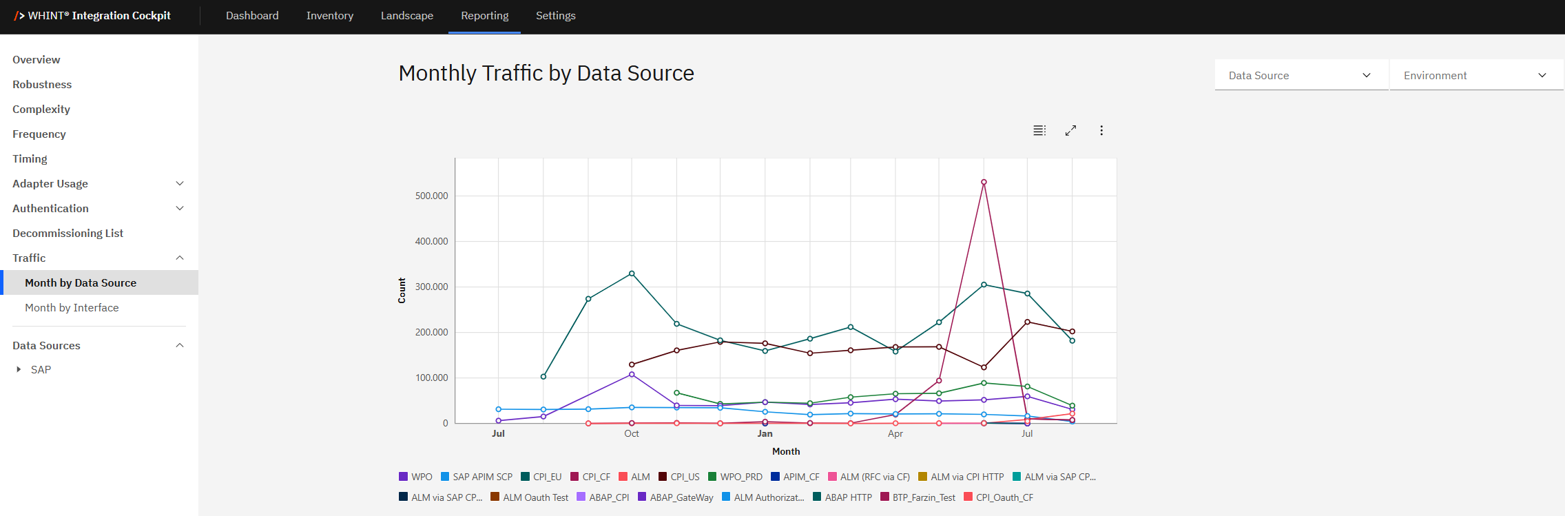
What you see:
-
Line chart visualization showing message count trends over time (monthly intervals)
-
Multiple data source lines with different colors representing various integration platforms
-
Data Source filter to select specific platforms for analysis
-
Environment filter to switch between configured environment views (e.g. Production, Test, Development, Quality)
-
Interactive legend showing all available data sources with color coding
-
Chart controls for fullscreen view, table display and export options
Using Traffic Analysis
The traffic visualization provides detailed insights into message volume patterns:
Chart Analysis:
Traffic trends:
-
Peak periods → Identify months with highest message volumes
-
Seasonal patterns → Recognize recurring traffic cycles across different platforms
-
Platform comparison → Compare relative traffic volumes between data sources
-
Growth trends → Track traffic evolution over the analysis period
Data source identification:
-
Color-coded lines → Each integration platform has a unique color
-
Interactive legend → Shows all available data sources (e.g. CPI_EU, WPO, ABAP_CPI, ALM, etc.)
-
Platform-specific patterns → Different data sources show distinct traffic characteristics
Filtering and Customization
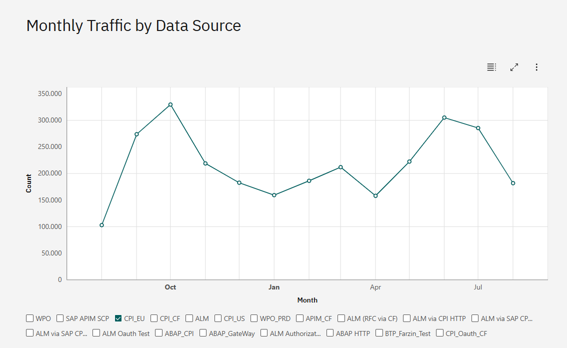
Data Source Filter:
-
Multiple selection → Select one or more data sources for focused analysis
-
Single platform focus → Choose individual platforms (e.g. CPI_EU only) for detailed trend analysis
-
Platform comparison → Select specific platforms to compare their traffic patterns
-
All platforms view → Display comprehensive landscape traffic overview
Environment Filter:
-
Production → Focus on live system traffic patterns
-
Development → Analyze development environment activity
-
Test/Quality → Review testing environment usage
-
Custom environments → View traffic for organization-specific environment classifications
View Options and Export
Display Modes:
Chart View (default):
-
Visual line chart showing traffic trends over time
-
Interactive legend for data source selection
-
Hover details for specific data points
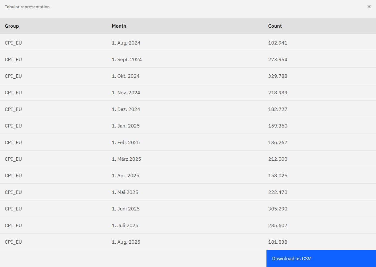
Table View:
-
Click "Show as table" to switch to tabular data representation
-
Detailed breakdown with Group, Month and Count columns
-
Precise numerical values for each data source and time period and download as CSV
Fullscreen and Export Options:
Fullscreen Mode:
-
Click "Make fullscreen" for expanded chart analysis

-
Enhanced view for detailed traffic pattern examination
-
Better visibility for complex multi-platform comparisons
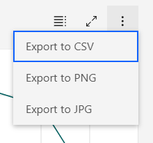
Export Functionality:
-
Export to CSV → Download traffic data for external analysis and reporting
-
Export to PNG → Save chart visualization as high-quality image
-
Export to JPG → Alternative image format for documentation and presentations
-
Access export options via the three-dots menu in chart controls
Traffic Analysis Insights
Monthly traffic analysis supports:
Capacity Planning:
-
Peak load identification → Plan infrastructure scaling based on traffic peaks
-
Resource allocation → Distribute resources based on platform-specific traffic patterns
-
Growth projections → Use historical trends to forecast future capacity needs
Performance Optimization:
-
Traffic distribution → Balance loads across different integration platforms
-
Seasonal adjustments → Prepare for predictable traffic variations
-
Platform efficiency → Compare message volumes to identify optimization opportunities
Operational Monitoring:
-
Trend analysis → Identify unusual traffic patterns that may indicate issues
-
Platform health → Monitor consistent traffic patterns as health indicators
-
Business impact → Correlate traffic patterns with business activity cycles
Navigation
Deep dive analysis:
-
Use Data Source filter to focus on specific platform traffic analysis
-
Switch to Table view for precise numerical analysis and data export
-
Combine with Environment filter for landscape-specific traffic insights
Cross-reference with other KPIs:
-
Compare traffic patterns with Robustness scores to identify stability issues
-
Correlate with Complexity metrics to understand resource utilization
-
Reference Decommissioning List to validate low-traffic interface candidates
Related Documentation
For comprehensive traffic analysis and monitoring:
-
Dashboard Traffic KPI - Understanding overall traffic metrics and thresholds
Last Updated: August 26, 2025